What makes a good thumbnail font
- Thick strokes. Thin letters vanish when the image shrinks to 168×94 pixels. Go for Bold, Black or ExtraBold weights.
- Condensed shapes. Narrow (condensed) fonts let you use bigger letters in the same space, which helps on mobile.
- Instant readability. No decorative serifs or script fonts for the main text. They work as an accent, not as the headline.
- Full character set. If you publish in other languages, check accented characters. A font that drops accents looks amateur.
The most popular fonts (and when to use them)
| Font | Style | When to use |
|---|---|---|
| Anton | Condensed, very heavy | Viral and entertainment thumbnails, short all-caps titles |
| Bebas Neue | Condensed, clean | Tech, business, vlogs; modern and direct |
| Impact | Condensed, heavy | The classic meme and reaction look; preinstalled on Windows |
| Montserrat (Black/ExtraBold) | Wide, geometric | Education, finance and "cleaner" channels |
| Oswald | Condensed, editorial | News, facts, documentaries |
| Poppins (Black) | Rounded | Lifestyle, beauty, friendly channels |
| Bangers / Luckiest Guy | Comic, playful | Kids, gaming, comedy |
Anton, Bebas Neue, Montserrat, Oswald, Poppins, Bangers and Luckiest Guy are on Google Fonts, free including for commercial use. Check the license before using any other font.
Text styles that stop the scroll
The font is only half the job. The text treatment (outline, band, shadow, glow) is what makes it pop off the background. A few of EdThumb’s ready-made styles:

Thick outline: the viral-channel standard
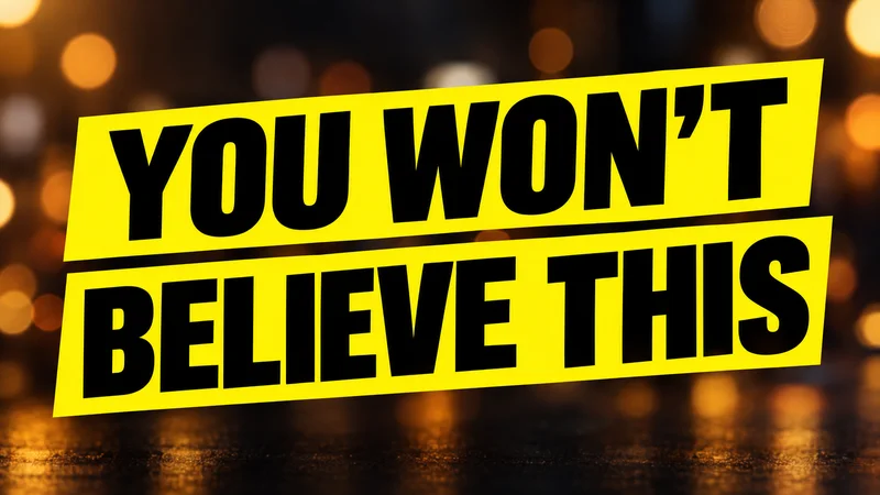
Color band behind the text
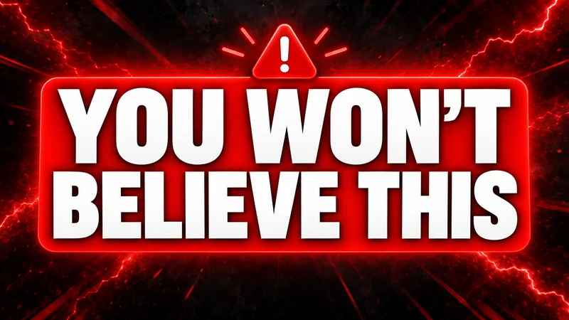
Urgency red for news and alerts
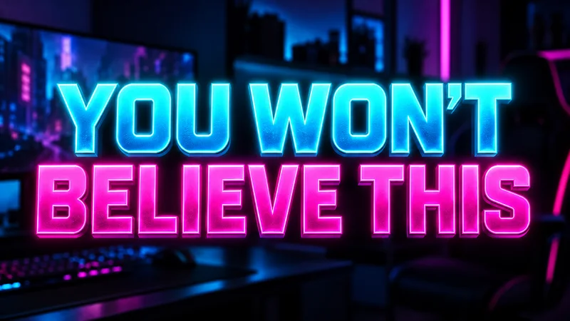
Neon for gaming and tech

Gold for finance and luxury

Comic style for humor and kids
Practical rules for size and pairing
- Three words max. With few words you can use huge letters, a third to half of the image height.
- All caps. Uppercase letters are more uniform and readable at small sizes.
- Always an outline or shadow. A dark outline (or strong shadow) separates text from any background, light or dark.
- Two fonts at most. One for the main text and, if needed, one for an accent. More than that is clutter.
- Highlight one word. Change the color of just one word (the most important) to guide the eye.
- Same font across the channel. Repeating your typography helps viewers recognize your videos in the feed.